Font Mixing

Intentional typeface clashing — multiple voices on one page, editorial collision as aesthetic principle, David Carson and Stefan Sagmeister as guiding spirits

Compare Font Mixing with another style →
Record025-FM
AestheticFont Mixing
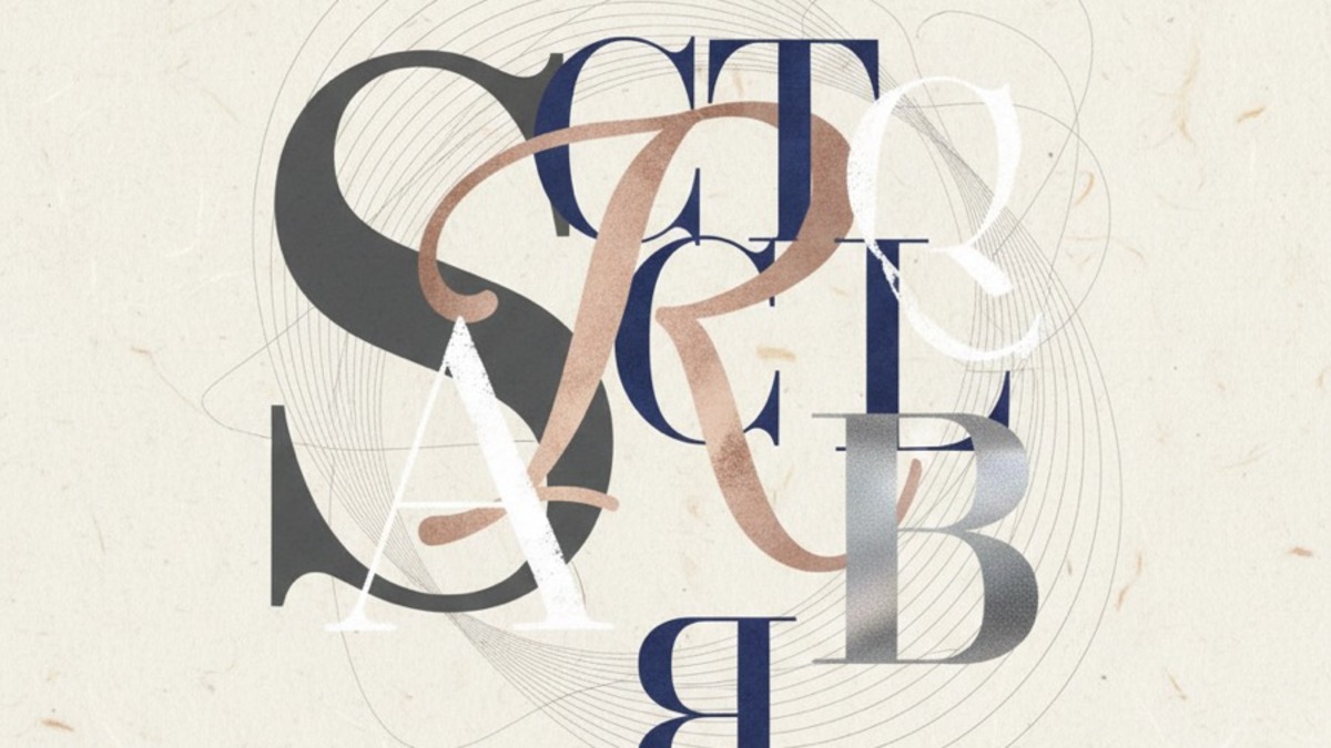
ClassExpressive / Chaotic
StatusINGESTING
Example of the Font Mixing aesthetic
Archive platefont mixing

Source document

Registrar's index cards on the platen glass — captured by the scanner

Elio Archive — Registrar's OfficeFont MixingFILE 025-FM
When to use it
  • Experimental editorial and magazine layout
  • Music album art with visual energy
  • Brand identities for eclectic cultural brands
  • Poster design with layered narrative
Perfect for
  • Cultural institutions and arts organizations
  • Independent publishers and zine makers
  • Experimental music and art labels
  • Fashion brands with strong editorial voice
What it looks like
  • Serif headline with compressed grotesque subhead
  • Handwritten script next to rigid monospace
  • Six typefaces in one David Carson layout
  • Poster with every font weight in one composition

Aesthetic profile

8-channel console — dominant channels taped & circled by the registrar

Attribute Console — 025-FM 8 CH ACTIVEFIG. 1
CH01Minimal
MaximalR·30
CH02Analog
DigitalR·10
CH03Restrained
ExpressiveR·60
CH04Cool
WarmCTR·0
CH05Futuristic
NostalgicR·10
CH06Structured
ChaoticR·50
CH07Dark
LightR·10
CH08Organic
GeometricR·20

strongest channels circled — leans expressive, chaotic, maximal ✦

Profile card

Your aesthetic passport — share the fingerprint

Aesthetic Profile
Font Mixing
MaximalDigitalExpressiveWarmNostalgicChaoticLightGeometric
ExpressiveChaoticMaximal
eliosignal.com/styles/font-mixing

Mood Board

Sign in to generate

Sign in to generate a mood board

Sign in

Editorial Depth

Sign in to unlock

Historical Context
Key Practitioners
What to Avoid

Sign in for editorial depth

Sign in

Cross-references

90s EditorialPoster CollageJapanese Graphic

About this aesthetic

What is the Font Mixing aesthetic?
Intentional typeface clashing — multiple voices on one page, editorial collision as aesthetic principle, David Carson and Stefan Sagmeister as guiding spirits
When should I use the Font Mixing aesthetic?
Use it for: Experimental editorial and magazine layout; Music album art with visual energy; Brand identities for eclectic cultural brands; Poster design with layered narrative.
What is the Font Mixing style perfect for?
Perfect for Cultural institutions and arts organizations, Independent publishers and zine makers, Experimental music and art labels, Fashion brands with strong editorial voice.
What does the Font Mixing aesthetic look like?
Visuals typically feature: Serif headline with compressed grotesque subhead; Handwritten script next to rigid monospace; Six typefaces in one David Carson layout; Poster with every font weight in one composition.

Build with the font mixing aesthetic

Elio turns aesthetic references into on-brand visuals. Generate, compose and publish from one studio.

Join the waitlist